Recycling is different everywhere. It’s important to be able to quickly and cohesively communicate what users can do with their waste when on the university campus.
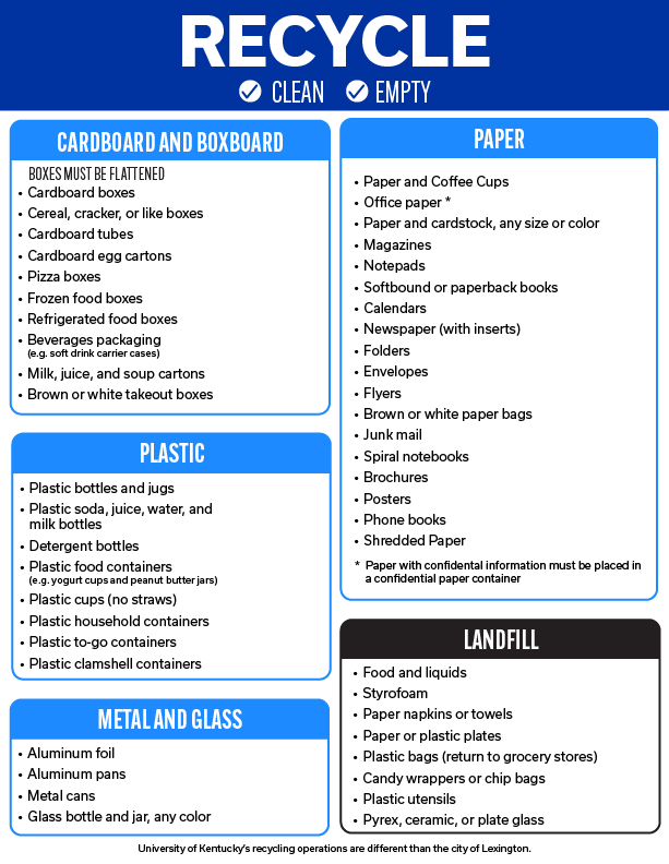
This recycling sign is an insert on our wallhugger bins that have a frame for any 8.5 x 11 inch paper. These wallhuggers are found inside buildings across campus.
When I joined UK Recycling, I saw room for improvement in the previous design. When tabling, I asked students their thoughts on the signage. Most found it informative but overwhelming when they are on go. I agreed with their sentiment and thought that there was a better way to inform our community quickly. I wanted to focus on the most common items people may carry while on campus. In my redesign, it was important to create a cohesive and decluttered design that highlighted the important information so everyone on campus could quickly and correctly dispose of their waste.
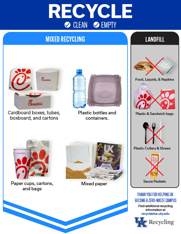
I also created location-specific inserts for dining retail locations that featured the waste items generated by each restaurant.
This design is used as a handout flyer and as inserts for the mixed recycling wallhuggers across campus.
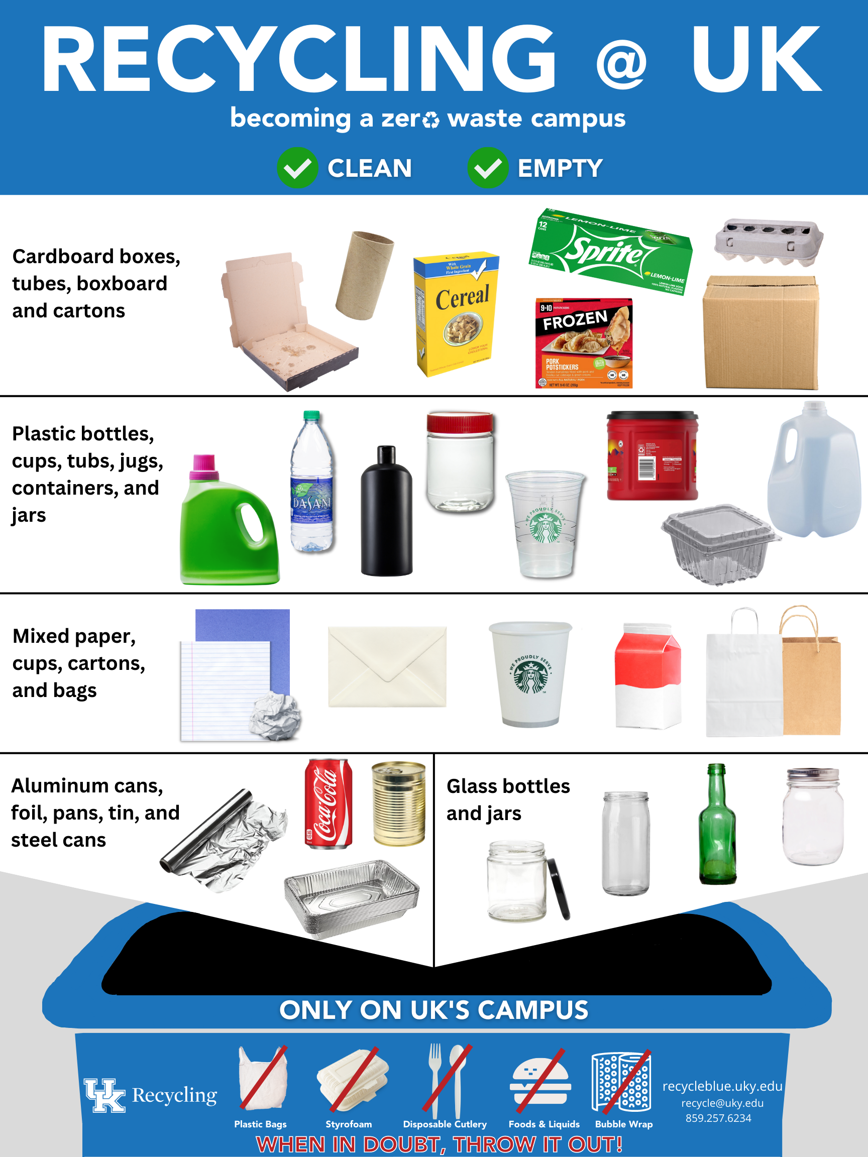
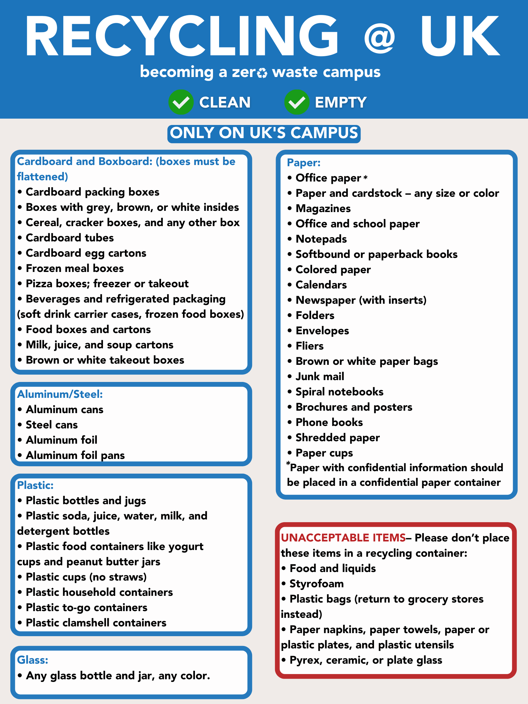
the latest signage design
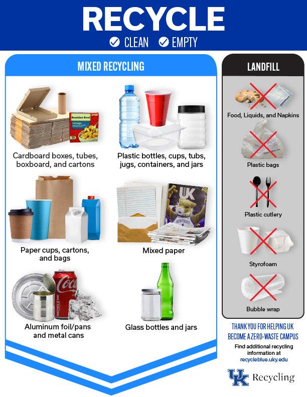
the front of the former design
the back of the former design

the front of the 2024 flyer design
the back of the 2024 flyer design